Black & white photography tips | Chris Bray Photography

Black and White Photography Tips

chris bray
Tutorial by Chris Bray
jonathan ives
and Jonathan Ives

There was a time when Black and White was the only option photographers had. Some of us started out shooting on Black and White film and can still remember spending hours in darkrooms painstakingly developing our images. There was a certain magic in that, and ever since, the romance associated with the 'simple' art of Black and White has lingered into our digital age. In the face of all our efforts to carefully tweak colours in post production and waking early to capture that warm glow of morning light, sometimes a good Black and White image can capture that which remains elusive in even the most vibrant of colour images.

black and white tips
Thanks to the digital age, Black and White photography has actually become a much more accessible and powerful medium, yet for many it still remains a mysterious art. Rather than just a technique to save contrasty photos or help hide colourful distractions (both of which are possible in Black and White), understanding how to shoot to create good Black and White images can open up a whole new field of photography to you - in situations where you'd normally not even bother.

While I appreciate that Black and White is a huge topic and can become as complex as you wish, I hope the following 5 key tips will help expand your current application of Black and White photography and help you capture some timeless Black and White images.

Tip 1) Shoot in Colour, then convert to Black and White yourself!

shoot in colour, convert to bw yourself

Most digital cameras give the photographer the option of changing the 'picture style' to a monochrome setting. This 'monochrome' setting on your digital camera basically just combines the different colour channels (red/green/blue) saving only the total brightness – not the colours themselves. For example, something that was 50% red, would look the same as if it were 50% green, or 50% blue – all would become indistinguishable as 50% black (AKA grey). Of course, the fact that they were different colours originally is of huge value in post processing the black and white image, allowing you to separate them, perhaps choosing to make red things become darker grey than green things and so on. Unless you are also shooting in RAW (see below), setting your camera to shoot in monochrome (AKA black and white) setting is a bad idea. While this option can produce reasonable results occasionally, the colour data (which is now lost) actually held a lot of valuable information which would have been very helpful in post production, allowing you to separate out or process differently the parts of the image that were different colours but similar brightness. Converting to black and white yourself later gives you significantly better control of your end result.

The other important reason to shoot colour is simply that if you shoot using the monochrome setting on your camera (throwing away the colour data), you'll never be able to get that colour data back, even if you decide you actually want a colour version of the photo later. You can always make a colour image black and white later, but you can't turn a black and white image back into colour!
how to get best black and white

Tip 2) What makes a good Black and White image?


I think part of the reason that black and white photography remains such a classic and romantic medium is that, at times, colour can be a distraction, taking away from the important constituents of a great photo such as shape, shadows, texture and simple composition. Without colour yanking the viewer's eye elsewhere in the photo, a good black and white shot can be much more pleasant to look at, with the viewer's eye guided through the image with the tried and trusted rules of simple composition, enhanced by subtleties of shadows, shapes and textures that might otherwise be overlooked.

B&W opera house sydney
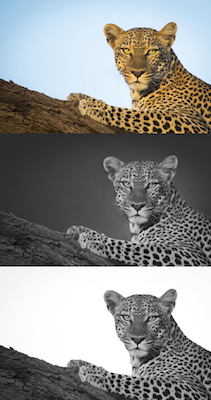
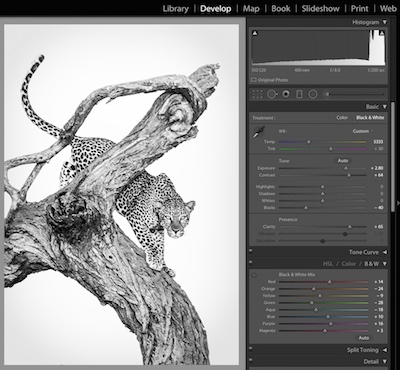
Learning to visualise what a scene could look like in black and white is tricky, but possibly the most crucial part of excelling in black and white photography. It's important to understand that not all subjects (and certainly not all colour images) work well as a black and white photo. Certain subjects and scenes look better in black and white than others. For example texture photos or high contrast scenes (eg harsh sunlight & shadows) can often look better in black and white (see tip 3 below). When intentionally shooting black and white photos, you'll need to begin to visualise the world in black and white. There is a cool way you can get your camera to show you your photos in black and white to help guide you, yet still retain the colour data for processing, but as explained in Tip 4, you need to shoot in RAW for this. Basically RAW files save all colour data regardless, so if you set your Picture Style to 'Monochrome', your camera will display the raw file to you as black and white, but when you load the RAW file in an image processing program such as Lightroom (or similar) you'll see and have access to edit the full colour image.

black and white zebra skin pattern

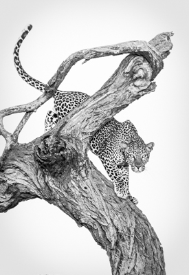
Shapes and patterns:

Simple shapes can be very effective in black and white photography. Look for shapes that have significant contrast and contain strong blacks. When colours are converted into black and white they become various shades of grey. The difference between the lighter colours (which become highlights) and the darker colours (which often become like shadows) is called tonal contrast. Shapes and subjects with lots of tonal contrast tend to stand out in a shot so a good starting point when approaching black and white photography is look for subjects with high tonal contrast. This is obviously the opposite to what we look for in colour photography, which is why aiming for black and white can sometimes bail you out when lighting is harsh, like during midday sunlight.

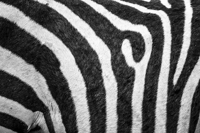
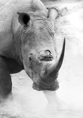
Details and texture:

black and white crocodile skin 
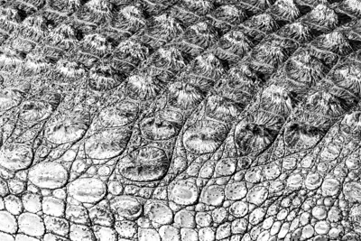
Assuming that a subject is not front-lit, small shadows created by even quite fine details and textures can really stand out in black and white, making for excellent images. This is why old, weathered subjects such as barns, old fence posts and even wrinkly old faces tend to look great in black and white as their rough surfaces can be accentuated.
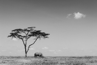
Simple composition:

black and white rhino tree
Applying good composition should be the aim of every photo, whether it's shot in colour or black and white. Without colour to help guide your eye to the subject in black and white images however, basic composition rules like leading lines and rule of thirds become even more important in guiding the eye. Ensuring backgrounds are simple and uncluttered also helps significantly with this.

Tip 3) Black and White can save high contrast scenes and remove colourful distractions.


opera house
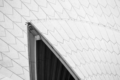
Traditionally, black and white photography has been a medium that desires contrast. This is the opposite in many ways to colour photography. Often black and white photos need high contrast to make the subject really 'pop' since there are is no accentuation through colours. This gives the photographer the option of taking photos in a variety of lighting conditions which would otherwise be unfavourable for colour photography. For example, a black and white photographer can often get away with shooting in the middle of the day, embracing the high contrast between the harsh sunlight and black shadows, particularly for architecture and landscape photography. If your colour shots contain a lot of undesirable contrast (i.e. the shadows are too dark, or the highlights too blown out) it may be worth converting them to black and white - you might be pleasantly surprised by the results.

The black and white technique can be also used to save an image otherwise ruined by a brightly coloured distraction. When looking at a colour image your eye is immediately drawn to contrasting colours like red on green. In black and white photography, assuming the colours are the same brightness, they will often convert to uniform grey and no longer be a distraction in the shot. Furthermore, with a little post processing work utilising colour separation, even if a distraction is a different brightness (e.g. a bright red car against pale green grass) you can selectively make the reds in your image paler grey until they match and blend in with the grey of the grass.

Tip 4) Shoot in RAW rather than JPG.


For the maximum control in the conversion from colour to black and white, I recommend you shoot your images in RAW. While shooting in JPEG certainly doesn't prevent you from converting your images to black and white later, you'll have a greater ability to alter your images if it's a RAW file. Just like when shooting colour, RAW files contain more depth of information than JPGs, allowing you to lift out more details in shadows and pull back highlights etc. in post production. Just be aware that shooting in RAW will create very large files and you will need to post process them (and then export them as a usable image file) before they can be put online, emailed or used in any way - even if you're just leaving them in colour. See our previous tutorial on RAW vs JPG on our website to understand this more.

Another great benefit (as mentioned above) of shooting RAW is that you can then safely set your 'Picture Style' to 'Monochrome' to have the camera display your images in black and white (a handy preview to help you visualise the scene in black and white), safe in the knowledge that all the colour information is still being saved by the RAW file for you to work with later. When you load the RAW file in an image processing program such as Lightroom (or similar) you'll see and have access to edit the full colour image. Many photographer's struggle to visualise a scene in black and white, so this little trick can give you a hand.

Tip 5) Processing Black and White images.


editing black and white photos in lightroom
Processing your black and white images is a huge topic in itself, and I'm no expert. There are many good programs to help you tweak and adjust your photo to give it a bit of extra punch in black and white - however I highly recommend Adobe Lightroom. In addition to being an amazing and efficient photo organising tool, it has excellent image tweaking tools, including great black and white abilities. Obviously how I tweak every photo is different, but the big secret in unlocking extra editing power for black and white images in Lightroom's 'Develop' screen is to click the 'black and white' tab in the 'HSL / Colour / black and white' section, which will instantly display the image in Black and White, but also present you with a set of colour sliders: Red, Orange, Yellow, Green etc. This is where it gets cool - grab the 'Blue' slider for example and slide it left or right, and you'll see just the parts of your image that were blue in the original photo become brighter or darker grey! It's astounding the control this gives you in creating a black and white image, drawing attention to the right parts of your image, dulling-down or enhancing certain aspects such as the sky, or the grass - whatever! If you don't quote know what colour a certain part of the image is that you wish to separately control (is that rock red, or orange?) then you can click the little circular target button in the top left corner of the box of sliders, which, as it says, lets you "Adjust Black and White mix by dragging in the photo". You can then simply click and drag (up or down) on a certain part of the black and white image to brighten/darken that precise original colour mix.

Some other some basic suggestions to experiment with include:
  • Tweaking the overall 'Exposure' first, watching the histogram to ensure you're not blowing out your detail in the highlights or burying details in the black shadows.
  • Upping the 'Clarity' for better detail definition
  • Darkening down the 'Blacks' until your histogram basically at least touches that left-hand (black) side of the graph.
  • Likewise lifting the 'Shadows' and/or 'Whites' until your histogram reaches that right-hand (white) end or at least close to it.
  • Enhanced contrast can be worth tweaking in black and white images.
  • Doge and Burn by carefully using the 'Adjustment Brush' (or hitting the keyboard 'K') to subtly darken or brighten certain regions of your image to direct the viewer's attention where you want it.
  • Adding in some 'Post-Crop Vignetting' (either subtly darkening or brightening the corners of your shot to bring attention to the subject) can look great on black and white images!

Extra Tip) Try Long Exposures.


black and white in lightroom
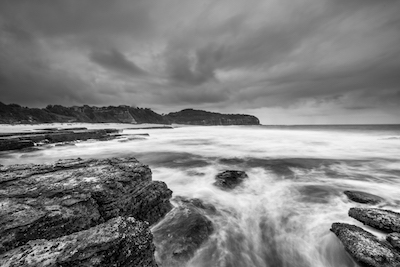
Personally, I love long exposures that capture a sense of movement in a scene. This concept works really well in black and white photography too, especially for landscapes when water and clouds are key parts of the scene. With a longer exposure, the whites in the moving water (which become the highlights in your black and white image) are spread over a wider area, helping increase tonal contrast and texture differences. The texture is particularly increased if there are crisp, stationary objects in the photo which juxtapose the soft movement blur. You can read our whole tutorial on how to take long exposures. Filters can also help you achieve long exposures and greater tonal contrast. An ND filter passes less light into the camera so the shutter speed has to compensate by getting longer, in turn achieving more movement blur. A polarising filter can also help greatly by darkening a blue sky and making clouds pop, which when converted to black and white can often add a striking mood to a photo. See here for a whole tutorial on understanding and using filters.

Definition: Monochrome, Black and White (black and white), or Greyscale?

If you're reading more about black and white photography, you'll come across these three terms. These terms are sometimes used interchangeably, which is incorrect and can be confusing.

'Monochrome' is an overarching term used to describe images comprised of only two colours e.g. black and white, or brown and white (sepia), and usually all their combinations (eg grey in black and white, and light browns in sepia). What's important to realise is that monochrome doesn't necessarily mean black and white.

Technically speaking - and here's where it gets confusing - a true 'Black and White' image should be comprised of only pure black and pure white – no greys - the kind of result you get from a fax machine or black pen on white paper. This is NOT what photographers (or anyone else, except in certain printing applications) are referring to when they talk about black and white photography. Correctly speaking, we should refer to our black and white photos as being 'Greyscale' (because they contain all the shades of grey too) rather than 'Black and White', but no one does, and far be it from me to try and change everyone. In this tutorial, when we talked about black and white, like everyone else, we actually mean 'Greyscale'.

That's it!

I hope you've enjoyed reading our top 5 tips to take better Black and White photos. Why not start experimenting with black and white next time the lighting gets harsh, or try going back through and converting some of your existing colour shots. Better yet, go out and do your own photo shoot specifically for black and white, to try and start getting your eye trained to 'see in black and white' to create some amazing images. We'd love to see your efforts, so if you get a chance to post some onto our Chris Bray Photography Facebook Page, that'd be great!

Did you find this tutorial helpful?


If so, please click the 'G+' and Facebook 'Like' buttons below to help others find it, then enjoy other free tutorials here.

Thanks!


My Customers